Showing posts with label Contemporary Home Designs. Show all posts

Wednesday, July 6, 2011

Kitchen Islands


There's something so calm and peaceful about this kitchen yet, at the same time, it's seriously calling your name to whip up a special meal and enjoy. The beautiful lines, neutral color palette and textures that extend through to the kitchen island pull this whole space together. The dark no-back bar stools work in the space by adding a touch of balance that matches the dining table. Design tip: consider using a similar design element for your backsplash to add harmony to a smaller space. In this case, marble.


In this pretty space, the kitchen island acts as the true hub, providing balance and harmony. With design styles mixing from industrial and modern to classic touches, the kitchen and the island represent a functional, well-designed space. The large island with an open frame works in this space, matching the design style of the counters and farmhouse sink. With a metal rack shelf below and the cement countertops above, the island houses the range as well. Very much a space any cook would love.


Designing a functional and stylish kitchen island can make a big impact in kitchen, often a room that can feel small. In this case, using the same monochromatic color palette and sustainable wood materials for the island that spans the kitchen spaces will make the space feel bigger. The sustainable wood is used on the base of the islands and the cabinets, allowing the eye to keep moving throughout.


What a dream space? This entire kitchen is inviting, cool and feels like such a modern classic. Using a black and white contrast with metal hardware throughout the entire space, including the large island, really adds dimension and absolute style to this space. Since there are tons of clean lines on the island, one way to soften the feel is to add a rounded support under the lip of the countertop. This adds a bit of design style and connects the rounded light fixtures.


For those loft lovers out there, this kitchen space provides some serious inspiration. The designer chooses a simple and open kitchen island to accommodate the large space. Often a solid consideration if you are looking for an anchored space for people to dine or to use for prep.

Friday, April 1, 2011

Full Exposure/Part 4

Glass island (© Warth & Properties/M. Richter)

Glass island

For $13.73 million, a glass and steel home in Son Vida on Mallorca, the Mediterranean island off the coast of Spain, offers much to admire, thanks to its windowlike walls.

Palma-ramic views (© Warth & Properties/M. Richter)

Palma-ramic views

Secured in a gated community overlooking the city of Palma, the Bay of Palma and surrounding mountains, this home offers security and unrivaled natural beauty.

Martha's old crash pad (© Mark Thomas Amadei/Sotheby's International Realty)

Martha's old crash pad

Private homes aren't the only way to get full exposure. Renowned architect Richard Meier designed a number of glass-walled apartment buildings that have attracted celebrity interest. A penthouse duplex in his iconic Perry Street Towers in New York is for sale for $13.9 million. It also happens to be Martha Stewart's old crash pad.

From the terrace (© Mark Thomas Amadei/Sotheby's International Realty)

From the terrace

This really is life in a fishbowl: The apartment has four terraces and spectacular views of the Hudson River and Manhattan through the 11-foot, triple-glazed and UV-protected glass walls.
The views go both ways. But while neighbors and traffic on the West Side Highway might be able to gaze inside, physical access is restricted by a keyed elevator.

Wednesday, March 30, 2011

Full Exposure/Part 3

Rebellious roots (© The Modern House)

Rebellious roots

This London house overlooks the Victorian-era Highgate Cemetery. Philosopher and economist Karl Marx and punk impresario Malcom McLaren are just two of the famous figures buried in the backyard. 
The windows are almost entirely frameless on the cemetery side, while the street side is a curtain wall of honed black granite, steel panels and opaque glass, for privacy. The house is listed for $7.97 million.

See-through courtyard (© The Modern House)

Talk about a skylight!!!!

See-through courtyard

Inside, you'll be dazzled by 4,225 square feet of living space with four bedrooms and bathrooms. The kitchen has a retractable skylight that transforms the space into an open-air courtyard.

Staying cool (© The Modern House)

Staying cool

Designed by architect Eldridge Smerin, the house replaced a 1970s structure by John Winter. The idea was to design a building with significantly lower energy consumption than the original but with a greater floor area. The home has a green sedum roof, and its temperature is moderated by its stone and glass construction.


Tuesday, November 30, 2010

Glass Houses

Interior fireplace

If you follow my blog you are aware I love glass houses, this one truly gives you the
experience of bringing the outside indoors. The Fireorb fireplace frees up floor space, and the spindly tables, chairs, and even kitchen counters help the home feel uncluttered.

Santa Monica custom home winner dining room

The dining room opens onto the semi-walled entrance area. The open floor plan and careful window placement eliminate the need for air-conditioning.

Modern prefab home

The result of a design/build class taught by Jennifer Siegal and Michael P. Johnson, it’s a dynamic, livable house that honors Frank Lloyd Wright’s legacy while tackling important design issues of today, from innovative prefabrication to sustainable systems like solar panels and rainwater and gray-water collection.

Landscape and architecture home design

Sustainable features and native plants up the ante on a seamless integration of indoors and out.

Green roof garden

A grassy roof helps keep the kitchen from heating up in warm months.

Sliding doors let evaporation from the swimming pool cool the house.

Urban living apartment building

The use of a structural steel frame allowed for more flexible floor plans: Someday, for instance, units A and C could be combined to make an apartment large enough to house a home office, an aging parent, or a growing family.

Seattle rooftop home roof and view

The roof's deep overhang keeps the rooms cool even though the walls are glass.

Eco-friendly home design

Geothermal systems that heat and cool the house, and solar panels providing power, let this house sit relatively lightly on a dramatic landscape.

Custom-built glass home

This largely glass house slices across the steeply sloping site, taking advantage of the mature trees, which help preserve some privacy.

Montecito custom home

As wildfires often ravage this part of the Santa Barbara coast, the architects chose fire-resistant materials (steel, concrete) for the construction.
http://www.olsonkundigarchitects.com/Projects/Type/Featured


Tuesday, November 16, 2010

Designer's Notes

charalambous-red-brown-living-room

Designer's Notes

The open plan allows for the large sectional facing the fireplace to address both the living and dining areas. The stone fireplace surround is mirrored in a venetian plaster finish on the opposite wall, while the wool and silk rug in the same range of colors ties the room together. I love this fresh feel of this room, clean and uncluttered.

charalambous-contemporary-living-room

The Living room was opened up to the areas around it. The small individual windows that were there before were combined into a large picture window overlooking the creek below. The concrete trough with the white pebbles in the foreground is an ethanol fireplace that brings drama in the evening.
I would add a few plants in the rock planter for a warmer feel.

charalambous-contemporary-orange-entryway

I again feel plants in the rock planter would add a warmer touch.
The architect took this builder-grade chopped up home and transformed it to an open plan, where light is shared throughout and space flows uninterrupted from room to room. The stair at the entry foyer was demolished and an open tread stair took its place, allowing for the daylight to filter in from all directions. Love the openess!!


Thursday, November 4, 2010

Fall Colors/Part 1 of 2


Elegantly Bronze

RMS user KatieKirby transforms her dining room into an elegant, coastal retreat. By tying in bronze hues from the ceiling, wallpaper and draperies, she emits a calming, yet formal atmosphere. An orange and red floral centerpiece brings in familiar fall colors that pop within the room.

Cultural and Exotic

This formal entryway was given a cultural awakening and a splash of our favorite fall hues. The columns display a copper tone also reflected in the floor-to-ceiling draperies. A warm, red Venetian plaster surrounds the focal point of the room: a framed Indian textile. A soft golden wall color tones down the bold orange sofa and red room accessories.

Bold Additions

A soft, neutral color palette is given a refreshing and fall-inspired burst of color with hues of orange, copper and wine.


Comfortable and Chic

RMS user Delltoid opts for a comfortable, lounge living room with a warm, inviting color palette. Chocolate-brown furniture and accessories complement the large pumpkin-orange sofa and surrounding beige walls. An animal-print area rug pulls in the entire palette for a unique and funky twist.

traditional carefree living room

Orange Tones

A fall-inspired orange accent color adds vibrancy to the tan walls and gray fireplace surround. Exotic patterns, colorful fabrics and sheer chocolate-brown draperies make this space elegant and visually appealing.


Saturday, July 3, 2010

Nooks

A cozy chaise, upholstered in a firefly fabric, provides a perch for reading and reflection. A eco-friendly floor lamp, fashioned from paper mache with a charmeuse shade, offers light during evening hours.


A faux-bois table, painted with low-VOC paint, serves as a perch for reading material. A Peruvian alpaca throw is close at hand should evenings turn chilly.


A steel-plated, sawhorse-style desk topped with glass offers an opportunity to concentrate on work. 


Tuesday, May 4, 2010

Hillside Home in San Francisco


We are happy to introduce you today to Scott Lee from SB Architecture.


The site is a very steep uphill slope that is nearly 50%. The site had been previously developed. The street is narrow and steep and access and staging are limited. The site affords views of San Francisco from all levels. The house is oriented to the South/West. Walking to the center of Mill Valley takes 4.5 minutes. Many houses on the street date back to the 20's and 30's and the lots are relatively small. The neighbors are lovely and have been both supportive and patient with us. We know more people on our street in Mill Valley after only living here for a few months than we ever know on our street in San Francisco where we lived for 20 years. The entire city is heavily wooded and we are blessed with a large heritage oak that frames views, provides shade, and gives the house a sense of permanence and maturity.

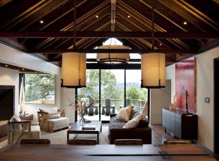
When I look at this house, I see all kinds of geometric play. My eyes break it down into blocks, yet at the same time I see the house as a unified whole. I'm so curious, what is your process when you are determining this kind of balanced massing? I'm imagining small model blocks and constantly changing collages - how do you do it?

As an architect I am concerned about classical relationships of order and symmetry and balance. We wanted to be sympathetic to those classical values, yet not replicate a house from last century. We wanted to make a house that respected the neighborhood and the context yet celebrated today's technology and 21st century architectural expression - - while not being cold and sterile. It was our intention to step the house back into the hillside and to break the massing with multiple roof forms and planes. The contrast between shade and shadow gives the house depth and dimension. The heritage oak presented massing challenges that ultimately worked in our favor as it has become the central feature around which the house has been sculpted.

Besides sustainability, what other considerations went into choosing the materials? How do they relate to the site?

We wanted to make a sustainable house but we did not want sustainability to define the aesthetic. We chose natural materials and colors that would age gracefully and patina over time. The Western Red Cedar siding is a modern interpretation of traditional shingles or clapboard siding. The dark grey and black of the trim and windows and doors gives the house an elegance familiar in the shingle style. We wanted a warm home that would comfortable to raise children and did not aspire to museum quality finishes. Erin Martin added quirky interior design elements that made the house less serious and more playful and inviting.

At risk of sounding a bit wackadoo, as I browsed the images of this house I thought of an REM T-shirt I have from the '80s that says "EARTH AIR FIRE WATER". I kept seeing these elements indoors and out and in

between. Were you playing with these elements or was I listening to REM while looking at your images?

I love REM! We love the outdoors and nature is what makes Marin so appealing. We wanted to bring to the house elements of nature such as the warmth of fire (three types - - fireplace, fire pit, and EcoSmart), the coolness of breezes, the thrill of showering and bathing outdoors, and the natural coolness that comes from being nestled against the earth.

Speaking of indoors and out, the lines between the two are certainly blurred with this house. How did you approach the relationship between the two?

We wanted to provide a variety of places to enjoy the elements in different ways. Covered porches, outside rooms, and sunny terraces allow our family and guests to take advantage of Marin weather in a variety of settings, most with views of San Francisco. Pocketing multi-sliders at both the Master and the Living Room extend those important spaces to adjacent terraces that are furnished for comfort and activity.

When designing residences, what kinds of features do you feel make a house a home?

It's the quirky things that are unique to the family and that may not appeal to everyone - - but that's OK. A home is a place that has been crafted to allow a family to enjoy each other and live a lifestyle all their own. Places for

interaction are the most exciting to design. At the Hillside House we designed the upper level to be the great room. The kitchen, dining, living, family rooms and terraces are all connected to each other physically and visually so that we can entertain and lounge and cook and eat together. Erin Martin was great at helping us furnish the house with found objects that reflect our sensibilities. Everything in not new - - there are many garage sale and flea market pieces that are mixed with fine and polished new things and I think that the juxtaposition between old and new, light and dark, soft and hard, rough and smooth are the things that add texture and
meaning.

Please tell those attending the tour some of your favorite details and/or features that they should take notice of while on the tour.

The connection between the garage and the upper levels of the house was difficult to design and build but well worth it in terms of functionality.

The separation between the guestroom and the main house makes both guest and resident feel a sense of privacy.

The exterior entry foyer and the salvaged wood and chain swing are fun.

The sculptural staircase and chandelier connect all levels.

Salvaged wood at the stairs and ceilings add warmth and reinforce the notion of the modern cabin.

The synthetic lawn is the perfect no maintenance view terrace.

Brian Kennedy is an artist and a friend who fabricated the black steel and grout master armoires, the fireplace surround and the entry door knob.

Guests love the outdoor shower with a view of SF.

The master shower with the NANA wall with open view make it function like an outdoor shower.

The master tub is outside and custom made by Concreteworks.

The kitchen is small but very efficient with concealed appliances and nooks and crannies.

Rope cabinet pulls are a clever Erin Martin invention.

The kids room ceiling wallpaper is unique and playful.

Heath Ceramics installed by TEAM TED TILE is amazing and makes all the baths and laundry rooms exude a hand crafted sensibility.

The master headboard is cow fur from Kyle Bunting.

The outdoor family room at the upper level is playful and durable.

Laundry chute connecting all levels was tough to work in, but functional.

The elevator functions more like a dumb-waiter and is very utilitarian and makes vertical living with kids a little easier.http://www.houzz.com/photos/professionals/6096/SB-Architects


Thank you for sharing your beautiful home with us Scott!

The AIASF is giving away a ticket to the Marin home tour to one of the lucky readers that will share their thoughts about this house and interview. via