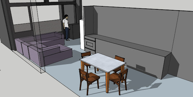
My son has a condominim in the heart of San Franciso, he is currently in the process of purchasing furniture and designing it around the space. He is dealing with a long retangular space which can be a difficult design process. Although, he has asked my opinons and some guidance, I am so proud of him for his own creativity in the project. These are pictures of the process and his statements. As you follow this process, we will share the final design when completed. I have made recommdations on artwork and other accessories which he liked, I am sure the final pictures will be dramatic.
His comments on the the picture above:
"I took some time tonight to model out the kitchen fixtures, the actual placement of the windows, the balcony, the grating on the balcony, and the dining room table. Doing this and rendering it in 3D showed me some things about the space that were important. The furniture and my apartment walls and fixtures are all drawn to scale. I have used purple-gray for the sofa's, but that's just so they're easier to see in these renderings. I'm still thinking about going with black for the sofas and chairs, maintaining the contemporary color scheme of blacks, greys and chrome. The cats won't destroy leather, and it would match the other sofa, so I'd go with that design."
"Above is the chaise lounge option. There is room for an end table or bookshelf to the right of the chaise. It does make a nice separate sofa area, but also constricts the passage to the space unpleasantly and feels kind of like a barrier."
"The two images above show that I can't get away with putting a love seat or anything longer than the 59" sofa in the space before it becomes a similar barrier. So I can't really put the focus on the sliding glass door. (Which is OK, because of the grating there's not much to see until you stand up anyway.) Plus two 59" love seats aren't really satisfying for the amount of seating I'd like."
"This is sofa config #1 from the original doc. I think I like this one the best. I'll have to find a new smaller coffee table, but that's OK. This gives me loads of seating (6), has visual interest, and does a nice job of dilineating the space without looking like a barrier. I know it covers the window and restricts the sliding glass door quite a bit, but I think I'm OK with that design. Mom had noted that this felt like too many pieces, so I'm thinking about that, too. I could replace the corner and armless chair with another left-hand 59" sofa, but that becomes less configurable."
BRAVO!!!! Great job Son.....I'm happy we agree on this final seating arrangement, the angle of the chair adds interest yet doesn't isolate the two areas, as my son mentioned, it also gives him more seating for entertaining.
I felt that this four piece art work arrangement would work well behind his dinette table because it is a long wall and works well with the chrome in his kitchen appliances. The pop of color brighten's the black and greys in the space.
I love this large piece for behind his sofa due to the tall ceilings and again add that dramatic pop of color.
Cortina's architectural design features a simple, cast iron base and translucent diffuser that shields the dimmable light source.
■by Pablo Pardo
■cast iron base; translucent diffuser
■two halogen bulbs included, wattage varies by size
This is the accent floor lamp he will use in the room, I love the contemporary style and the dimmable option for atmosphere.
As a final touch I recommended this great leather rug, it would add warmth to the room and help soften noises in the room due to the high ceilings and concrete walls. 
These are the overstuffed furniture examples I feel he should use and choose black leather. The large ottomans act as extra seating. I also recommend he purchase 2, one being for seating and the other as a coffee table.


No comments:
Post a Comment